
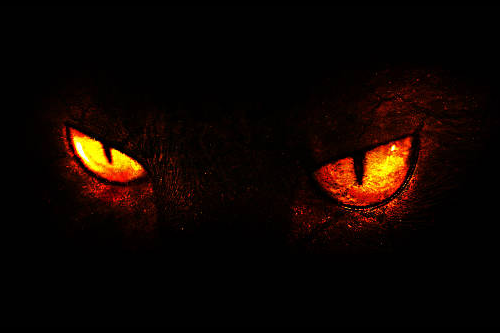
In 1984, the movie Gremlins told how an inventor buys a cute, furry creature called a mogwai as a gift for his son. But owning the creature comes with a warning: there are three rules that must be followed lest disaster occurs. We won’t spoil the ending for those who have never seen it, but we will say that the rules aren’t followed, resulting in the release of a monster, or should I say monsters.
Like Gizmo, the adorable, furry hero of Gremlins, good graphic design can bring joy, communicate your message and provide a great ROI, but bad design can cause harm to your brand. So, in honor of Halloween this month, we must warn you to follow these three rules to ensure your graphic design does not become a monster.
Rule 1: Stay on Your Brand Message
Good design communication stays on target with your company or organization’s brand message. Your brand reflects your values and what you’re about. All companies and organizations should have a brand message that is gospel, and all communication – print, website, social media, broadcast, etc. – should mimic that brand message and expression. This is what is known as “staying on brand.”
If your brand is serious and sophisticated, you don’t want to present your communication in a silly or comic demeanor. If your brand colors are more neutral or dark, you don’t want to begin using bright or pastel colors in some communication. When you establish a brand message, you should also establish brand guidelines that include items such as logo usage, color palette and font selections.
Rule 2: Keep It Simple
This is known as the KISS method. Don’t overload your design communication with unnecessary elements. Everything you include should have a purpose and should not be added just because you like the look of it. If it doesn’t strengthen your brand message, you don’t need it. If you cannot identify the purpose of an item – whether sections of copy or imagery – remove it. All it does is add noise and waters down your core message.
Rule 3: Be User-Friendly
Being user-friendly, or having good user experience (UX), is often related to online design, but those principles can – and should – be applied to all communication design. There are many aspects to user-friendliness in design. Let’s look at some of the most important ones.
Make sure your communication is readable. Obviously, you need to use proper spelling and grammar, but that can also mean using language the target audience doesn’t understand. Don’t use insider terms or references that very few people would understand. Also, don’t be long-winded. Brevity is important, especially in today’s culture. Why say something in 100 words when you can do it just as clearly in 25?
Create design that is visually pleasing. Select easy to read typefaces and font sizes and use proper spacing between characters and lines. Be aware of the visual contrast type and the background you use. Avoid type colors or hues that are too similar to the background colors, making it difficult to make out the characters, and avoid using a background image with too much variable contrast which can cause the type to get lost. If the text is too hard to read, your audience will not get your message.
Another user-friendly visual component to consider is eye flow. Think of your design as a map, and your challenge is to move the audience along in a particular manner, so they understand the message you want to communicate. Avoid breaking up sections of text with no discernable pattern which can make it challenging for the audience to know the order in which they should read the content.
Overloading the design with multiple visual images and graphics that are all the same size can lead to the same type of confusion. Like looking through a photo collage, your eye bounces all over the place with no idea of what to focus on. Instead, have one dominant visual element, and if you include other graphics or photos, have them take a secondary position by reducing their size.
As you can tell, the three rules have overlap and build upon one another. By following these rules, you can have a pleasant design that tells your story — not a hideous monster that scares your audience into running away. GREENCREST can help you deliver a message that is strong and visually appealing to your audience. Contact Us today for more information.